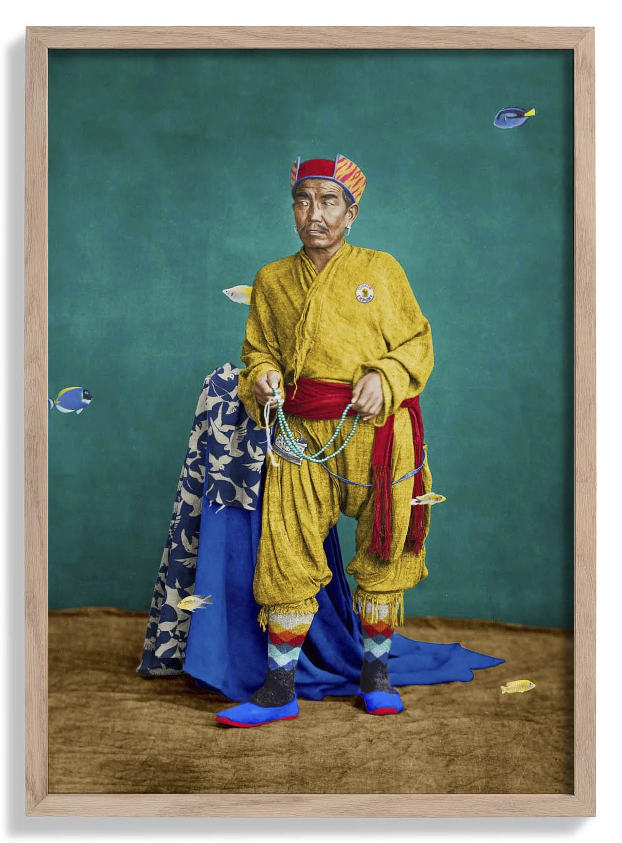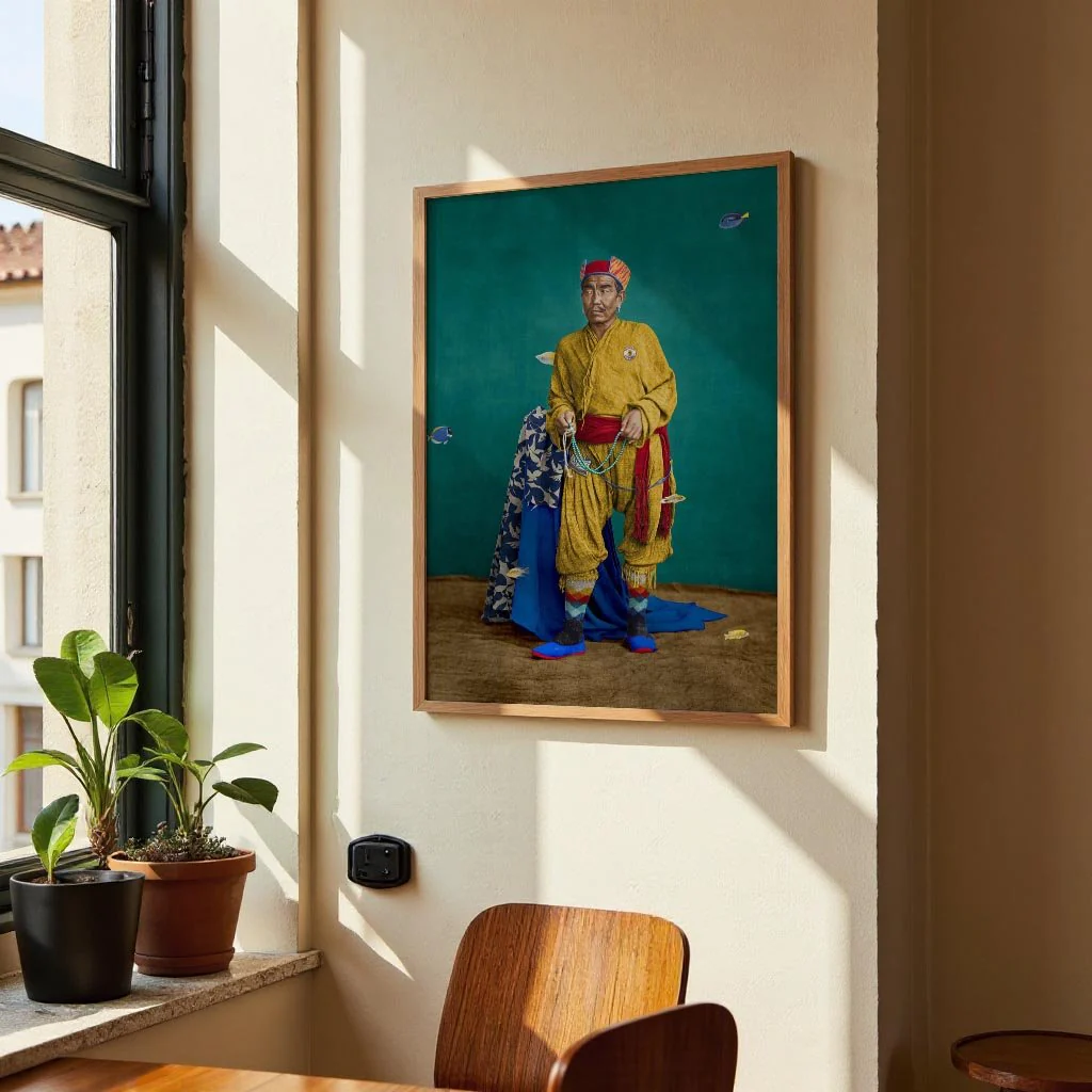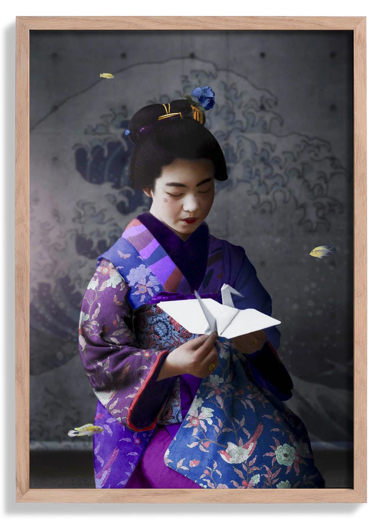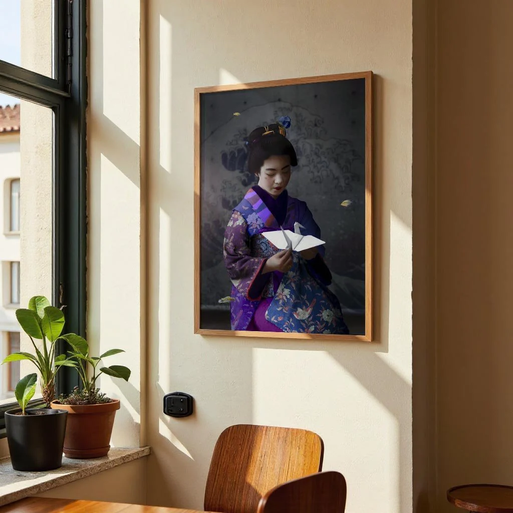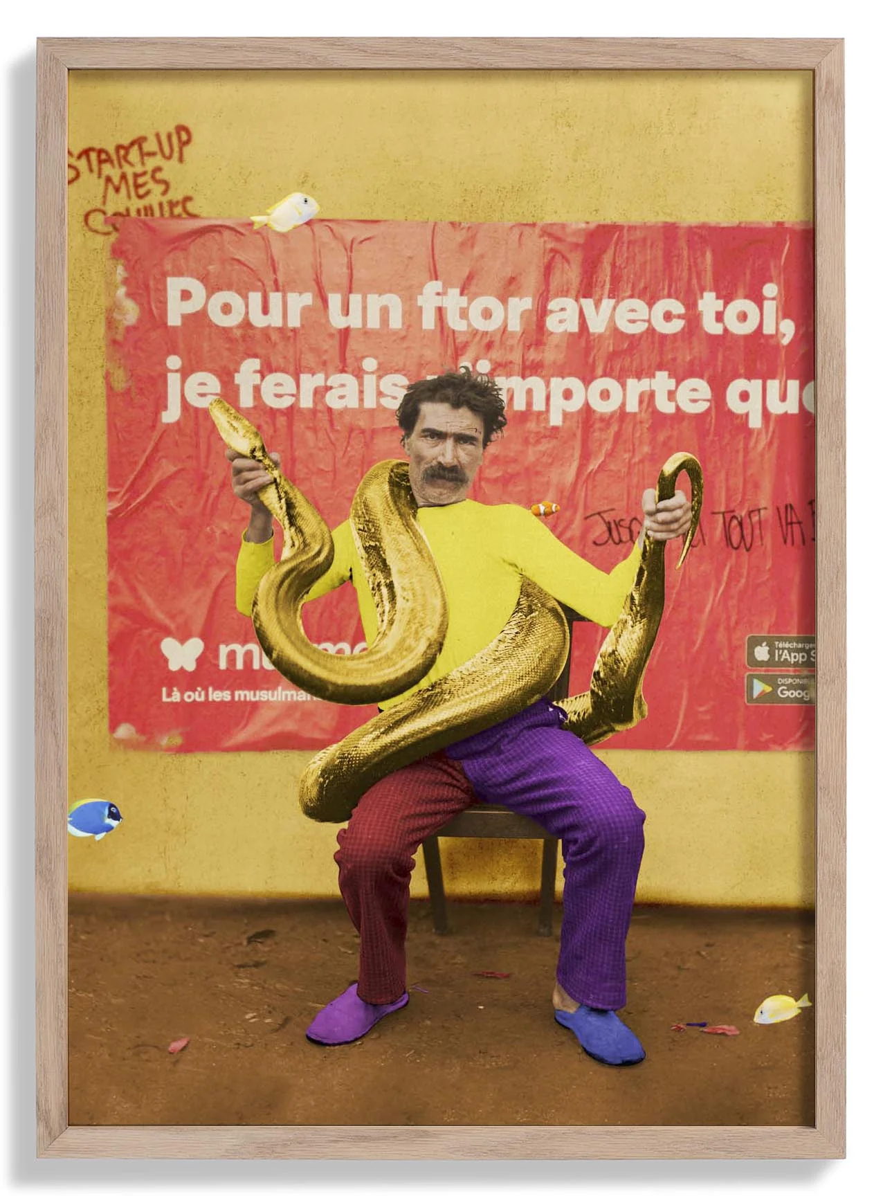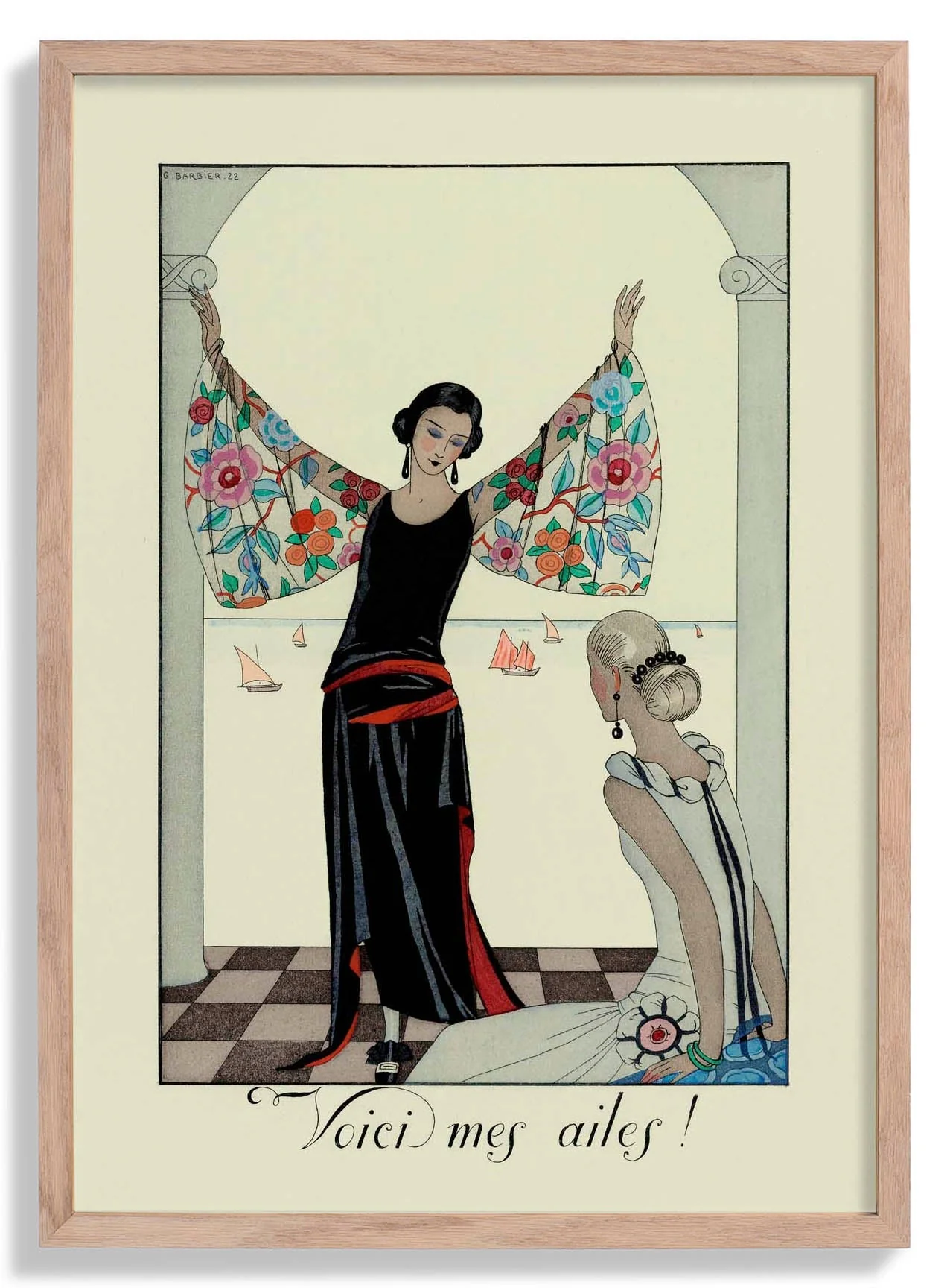
Oh La La Art Print
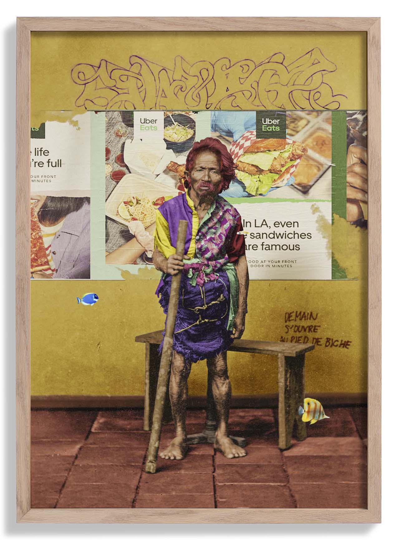
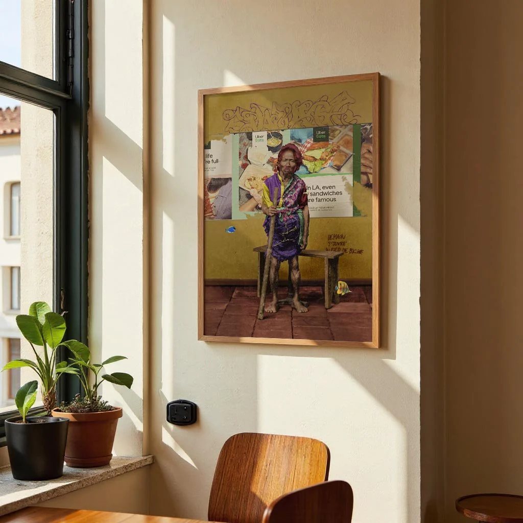
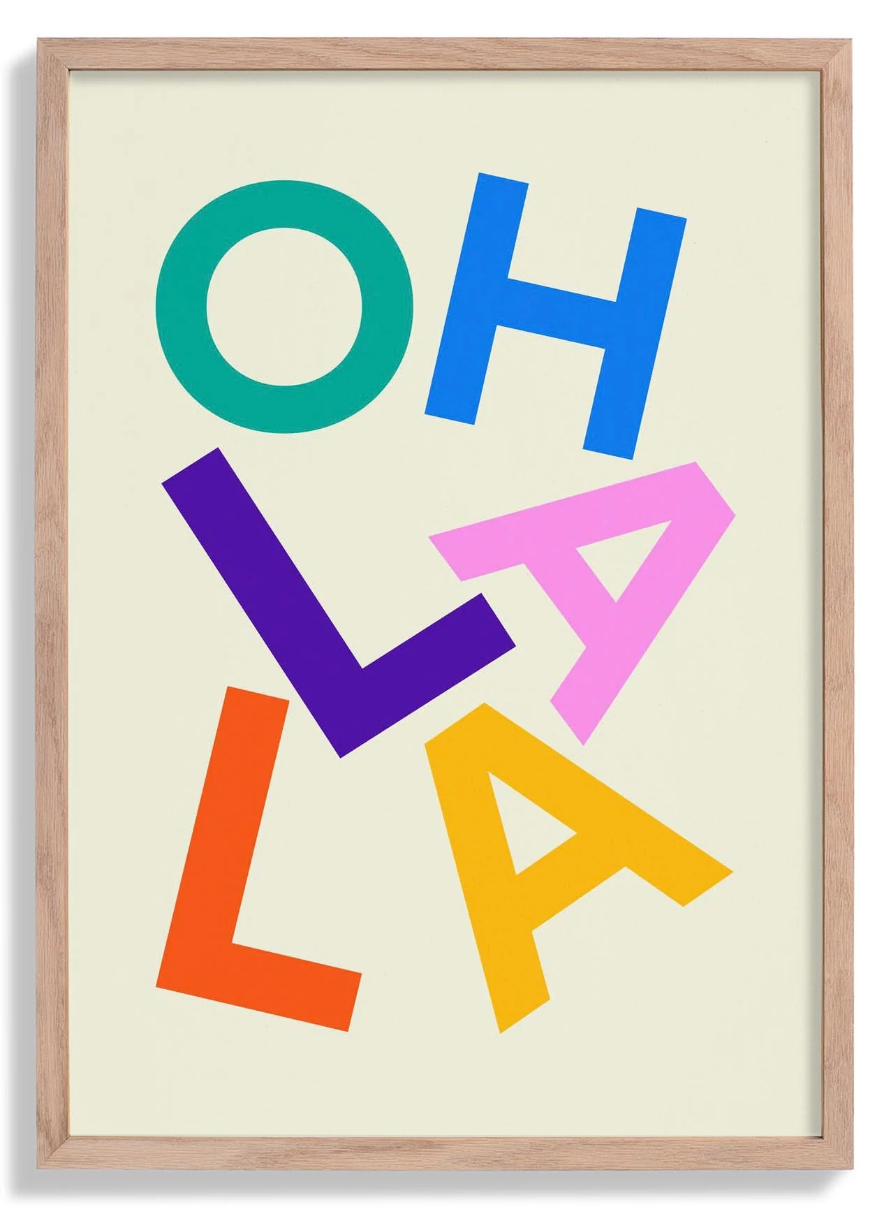
Oh La La is a graphic typography piece that turns language into visual rhythm. Nico Tracey arranges letterforms with confident asymmetry, using scale and weight to give the phrase an almost kinetic quality — the words lean into each other with a playful energy that recalls mid-century European poster design while remaining thoroughly current. The composition is tight and intentional, with negative space deployed as a structural element rather than emptiness.
As a fine art print, the typographic precision is preserved edge to edge — clean counters, sharp serifs, and high contrast without bleed. It prints exceptionally well at scale, where the graphic boldness of the design fully asserts itself.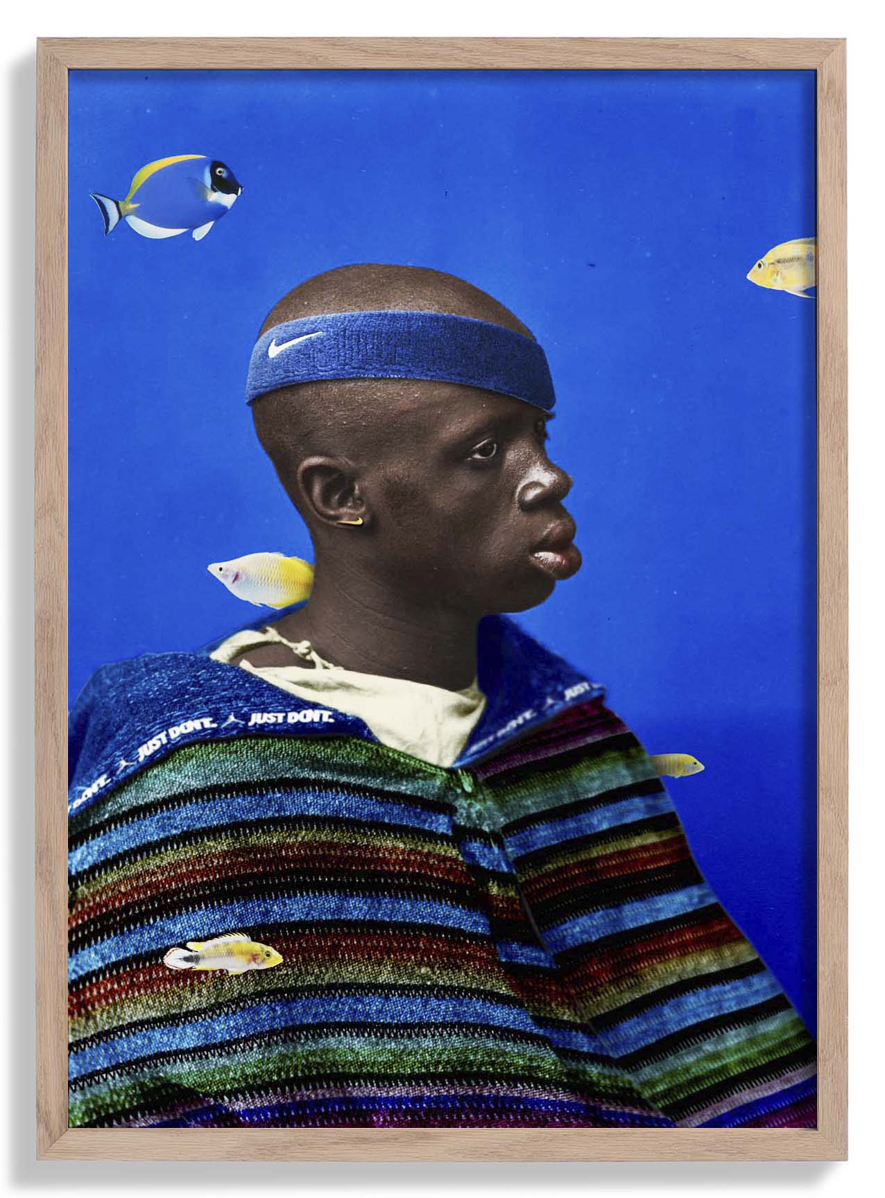
Original: $25.59
-65%$25.59
$8.96Description
Oh La La is a graphic typography piece that turns language into visual rhythm. Nico Tracey arranges letterforms with confident asymmetry, using scale and weight to give the phrase an almost kinetic quality — the words lean into each other with a playful energy that recalls mid-century European poster design while remaining thoroughly current. The composition is tight and intentional, with negative space deployed as a structural element rather than emptiness.
As a fine art print, the typographic precision is preserved edge to edge — clean counters, sharp serifs, and high contrast without bleed. It prints exceptionally well at scale, where the graphic boldness of the design fully asserts itself.