Contrast Blue And Yellow by Little Dean
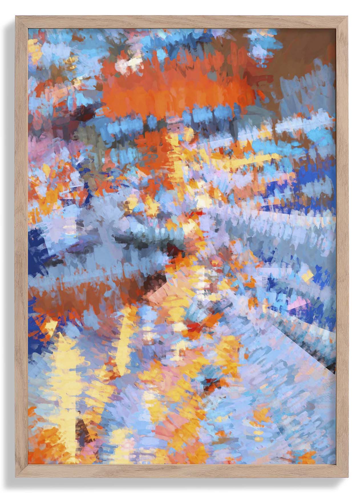
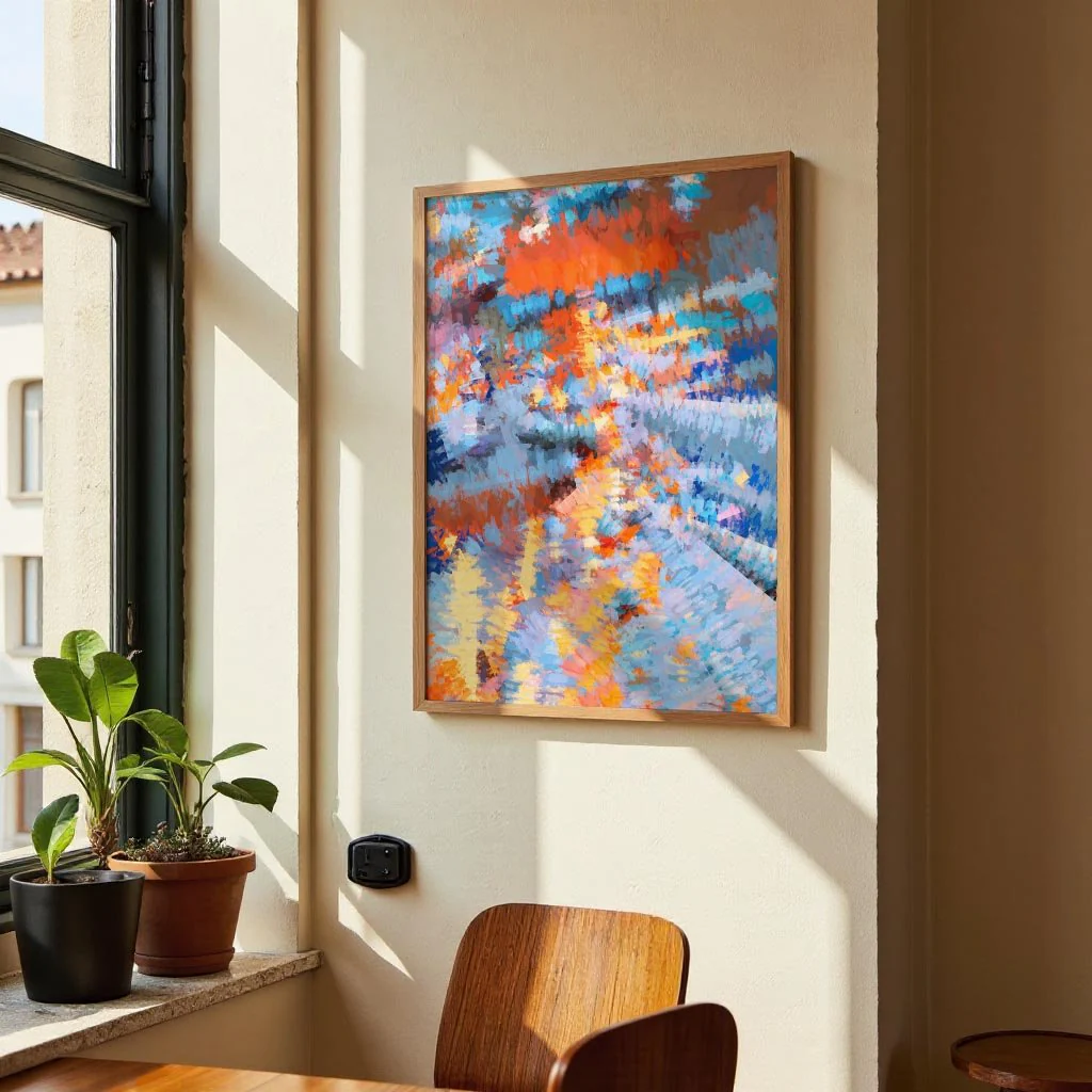
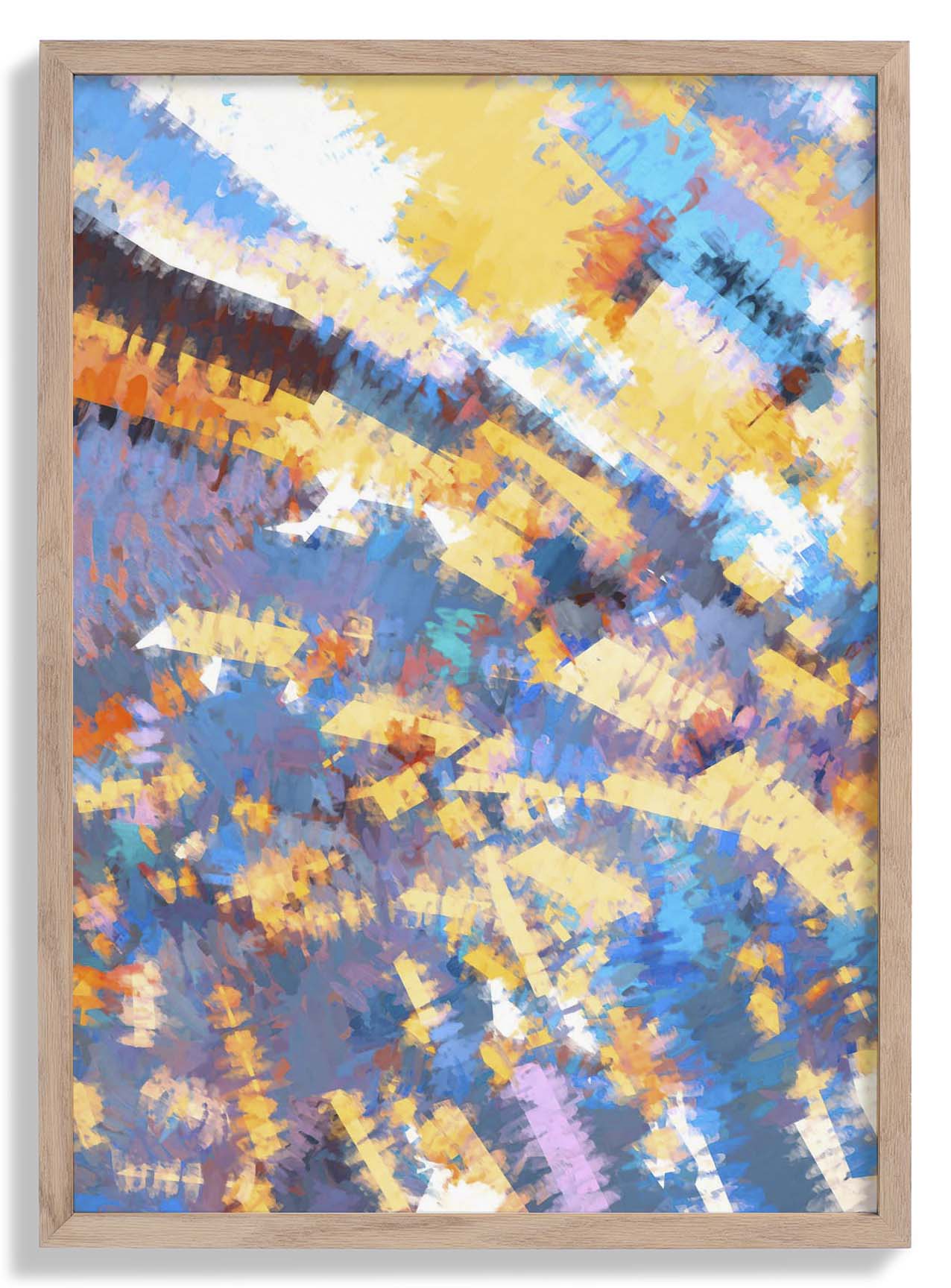
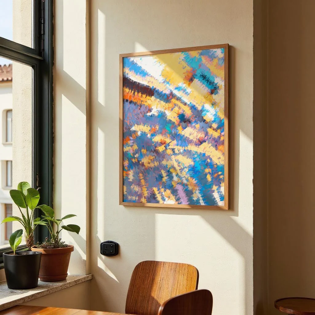
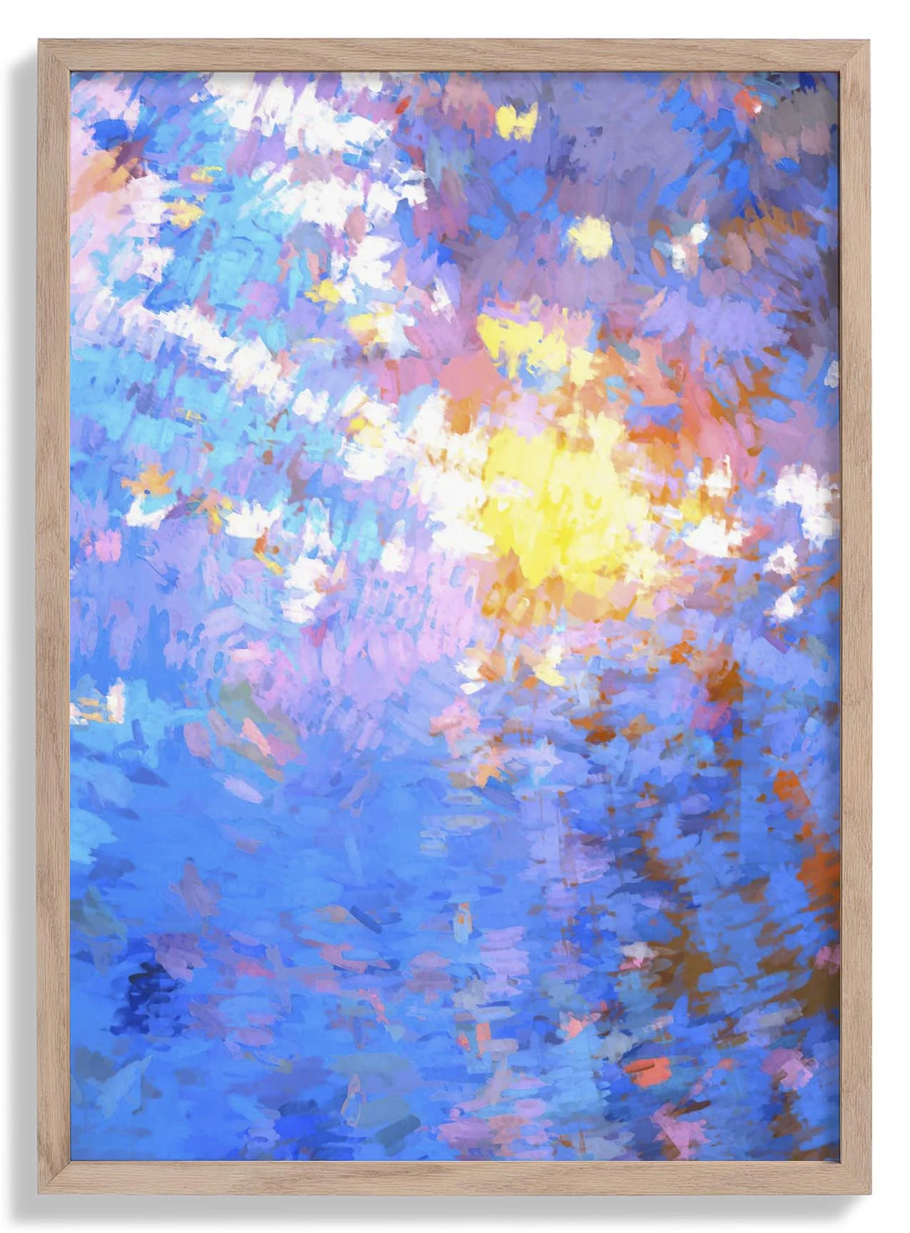
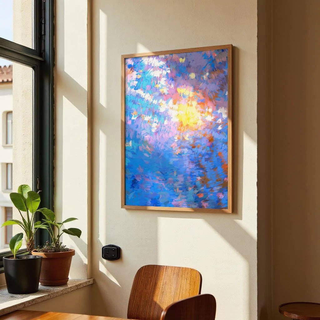
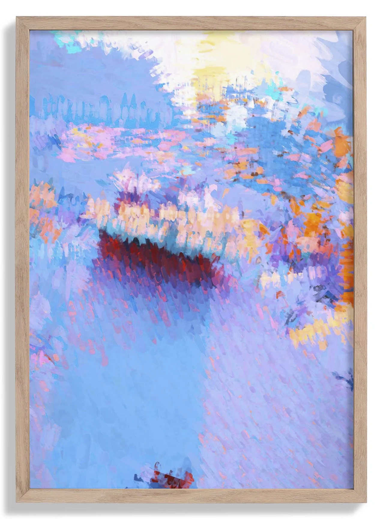
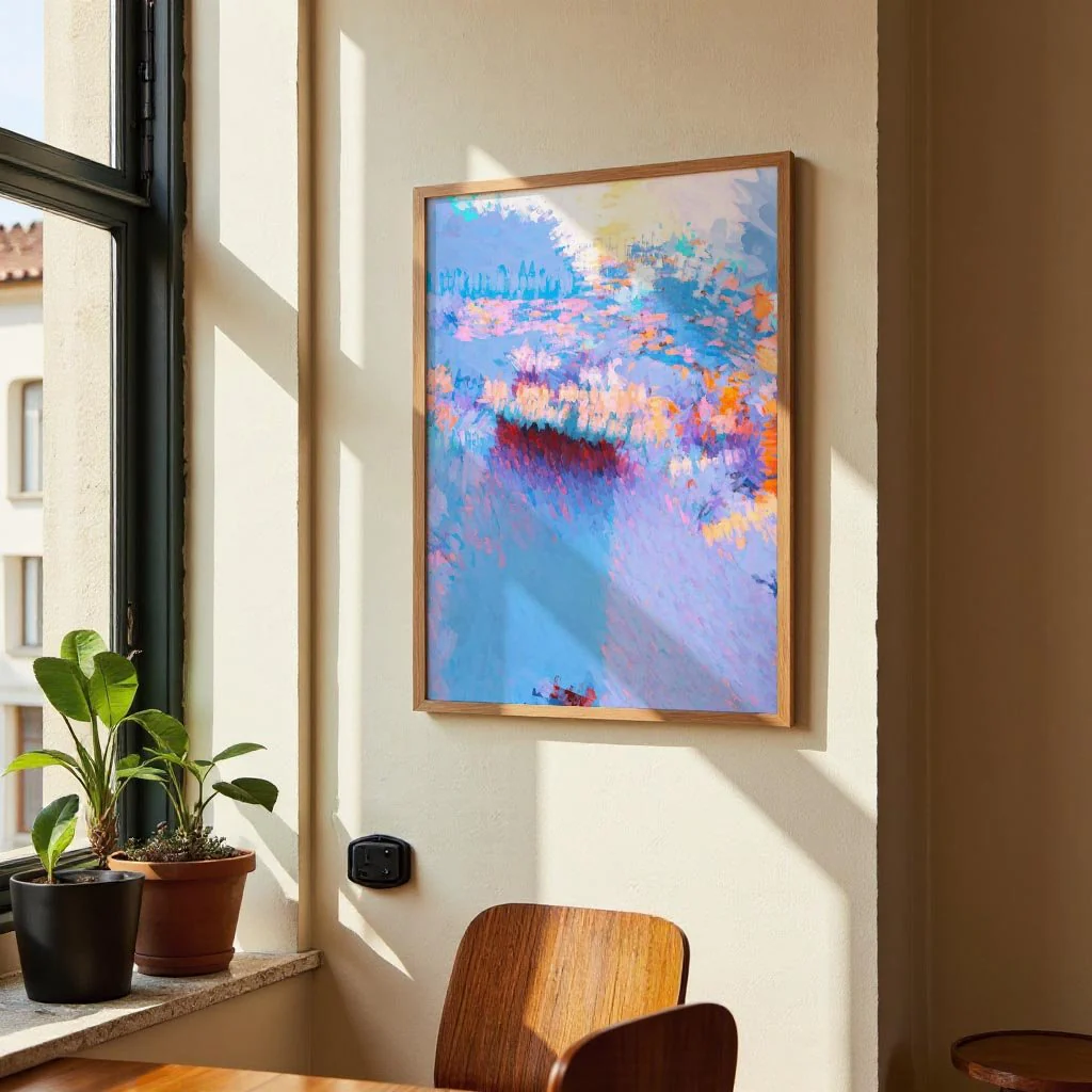
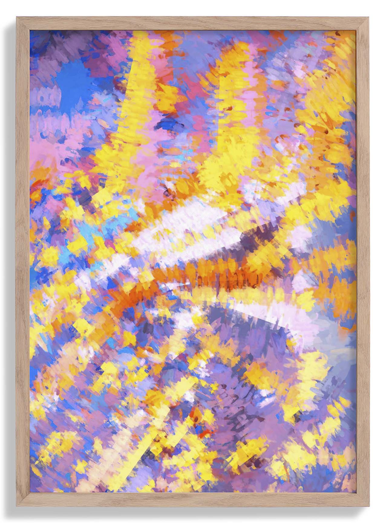
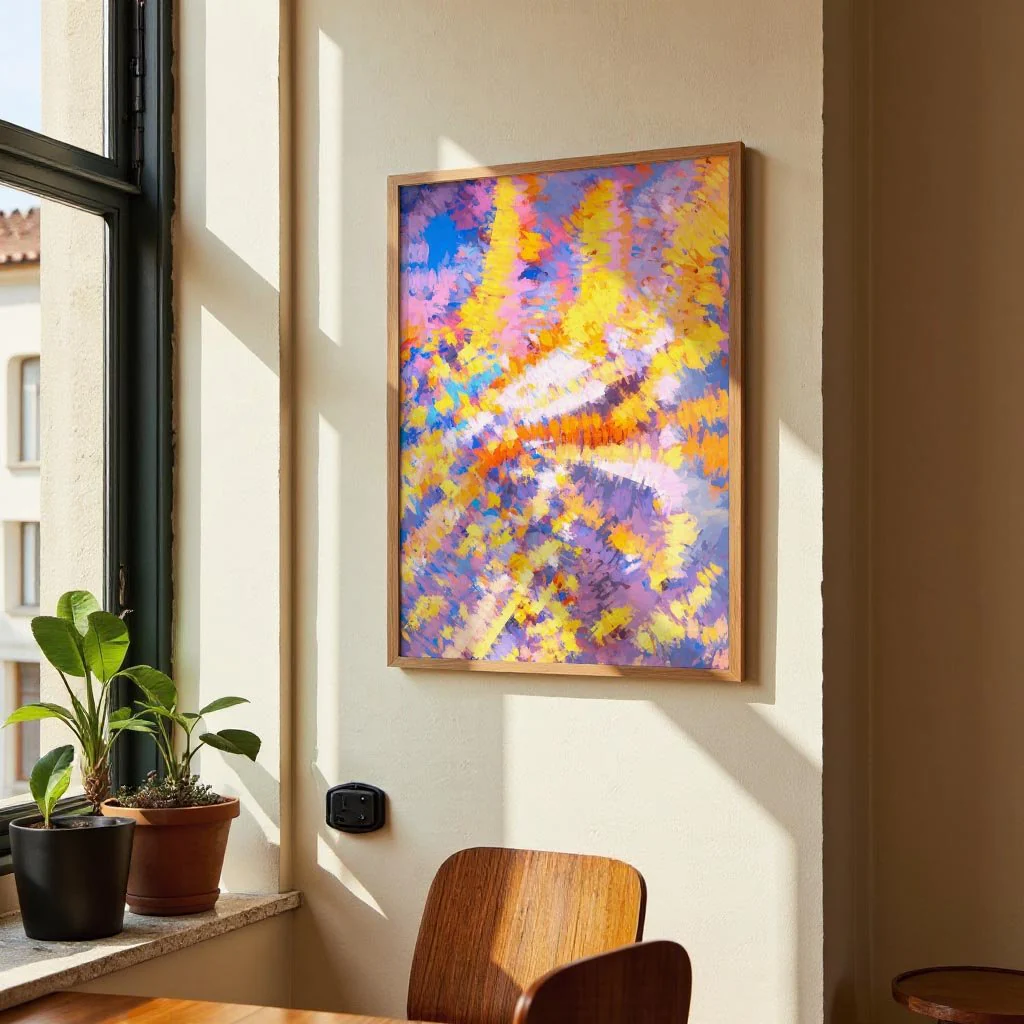
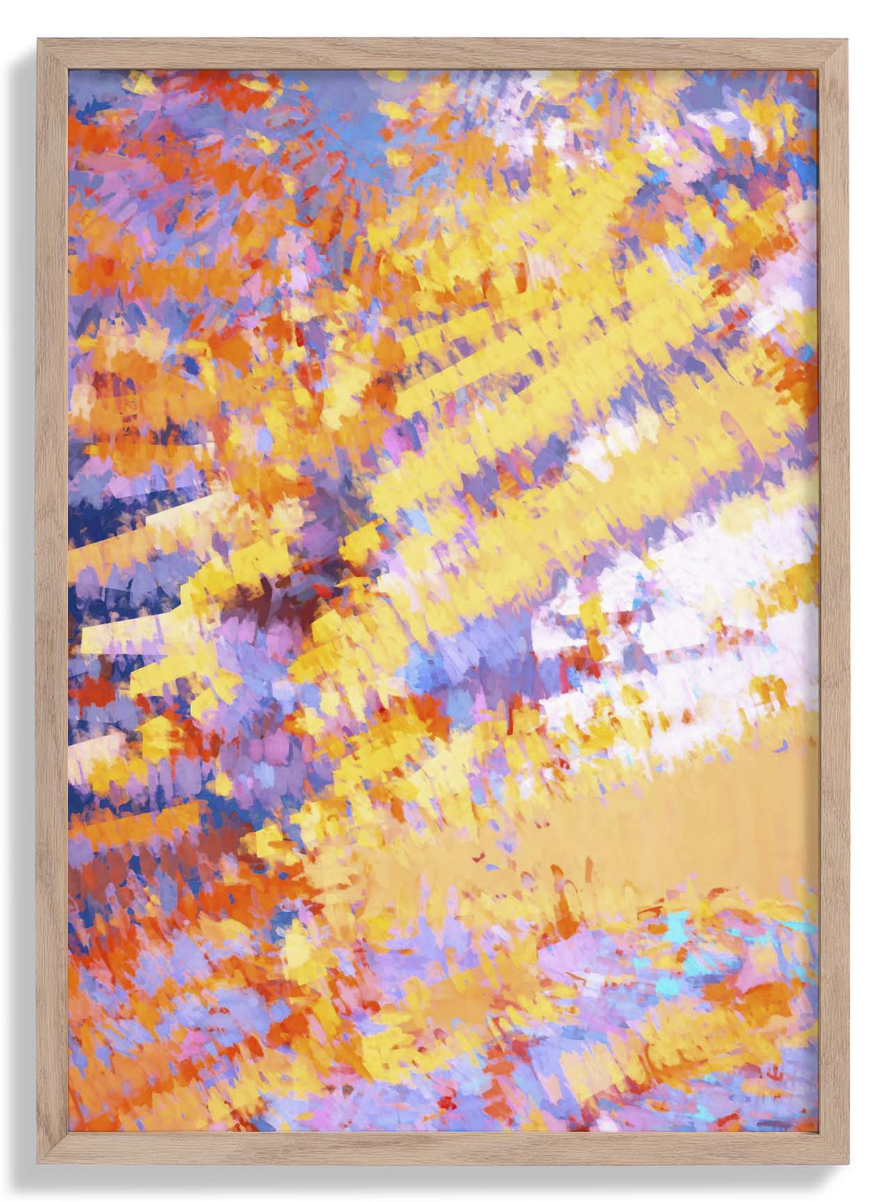
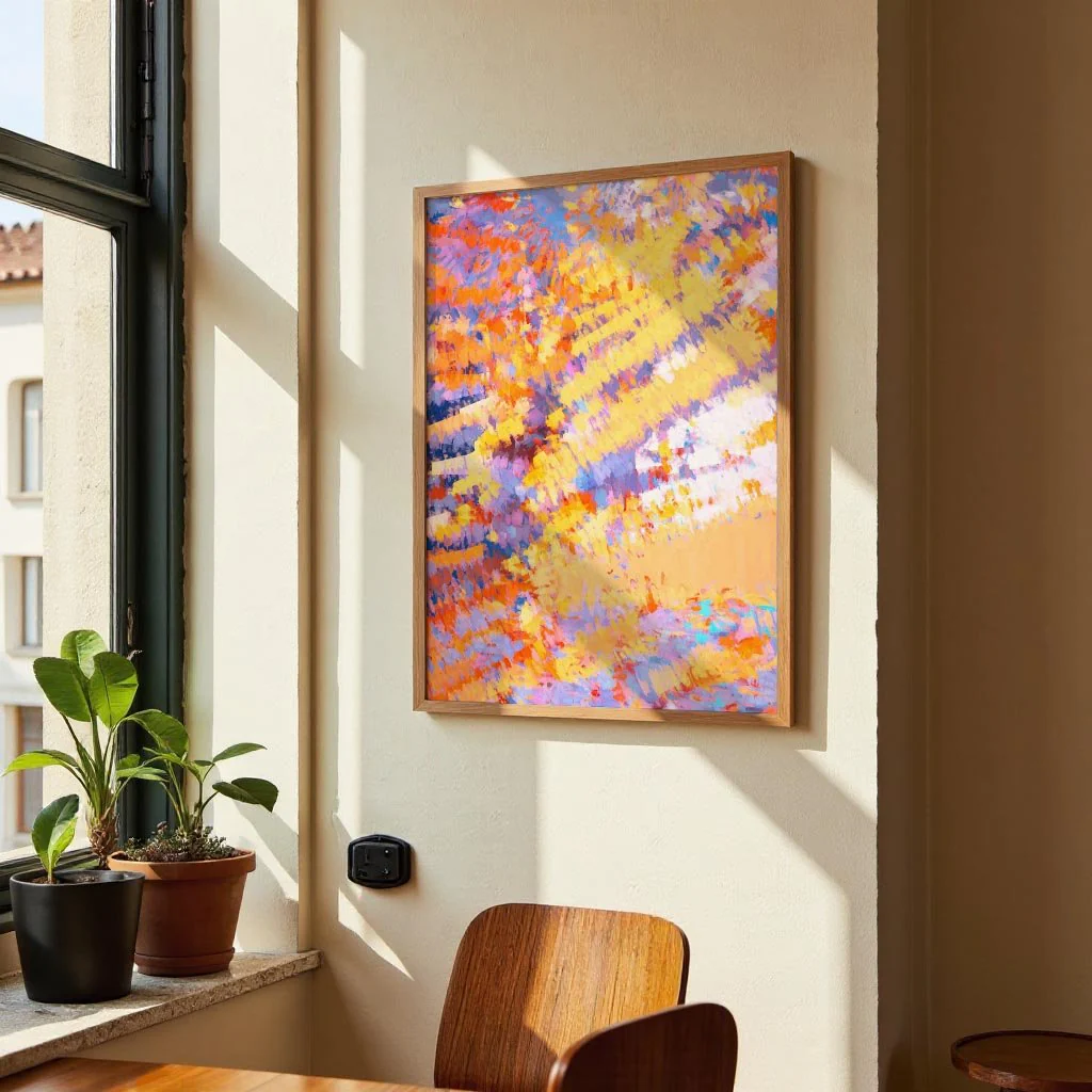
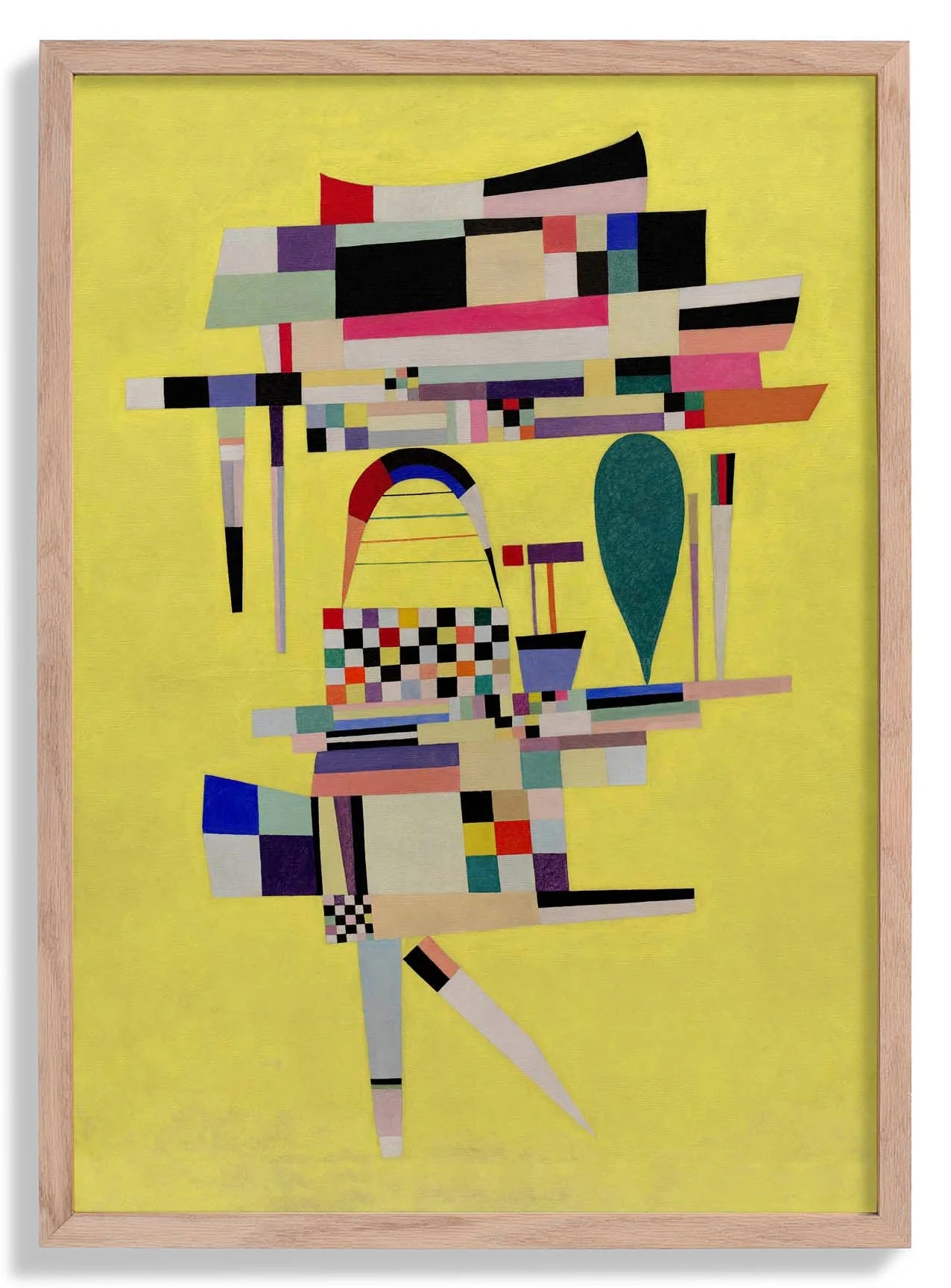
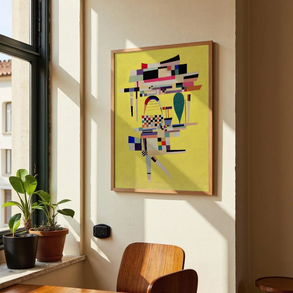
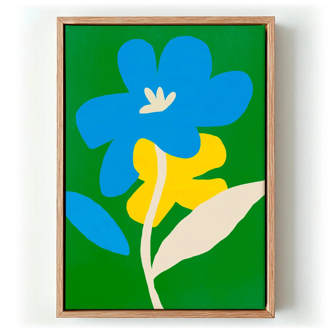
Contrast Blue and Yellow makes its case immediately. Little Dean sets a saturated cobalt blue against a warm, assertive yellow — two colours that share no common ground and are precisely that committed to disagreeing. Between them, botanical forms emerge: leaves and stems reduced to flat, graphic silhouettes that act as both subject and compositional anchor. The tension between the colours and the calm of the plant motifs creates a visual equilibrium that feels effortless but is clearly thought through. It is a design-led work that carries genuine emotional directness.
Printed as a canvas print in our Berlin studio, the high-contrast palette gains a layer of material warmth on cotton canvas — the surface softening the graphic intensity just enough to make the piece inviting rather than confrontational. Archival pigment inks preserve every shade with lasting precision.
Original: $53.50
-65%$53.50
$18.72Description
Contrast Blue and Yellow makes its case immediately. Little Dean sets a saturated cobalt blue against a warm, assertive yellow — two colours that share no common ground and are precisely that committed to disagreeing. Between them, botanical forms emerge: leaves and stems reduced to flat, graphic silhouettes that act as both subject and compositional anchor. The tension between the colours and the calm of the plant motifs creates a visual equilibrium that feels effortless but is clearly thought through. It is a design-led work that carries genuine emotional directness.
Printed as a canvas print in our Berlin studio, the high-contrast palette gains a layer of material warmth on cotton canvas — the surface softening the graphic intensity just enough to make the piece inviting rather than confrontational. Archival pigment inks preserve every shade with lasting precision.